Interview:
Richard Starkings
|
|
This interview was done through emails in december
2003
|
|
Matthieu-David:
Which artists influenced you the most ? And what
are your influences in general ?
Richard
Starkings : The artists that drew me into the world of
comics were Frank Bellamy, for his spot illustrations of
DOCTOR WHO in RADIO TIMES, Harry Linfield, Gerry Heylock,
Michael Noble, Ron Embleton and Frank Langford, for
their work on DOCTOR WHO, UFO, FIREBALL XL5, SPACE 1999
and CAPTAIN SCARLET in COUNTDOWN/TV ACTION and LOOK In
in the seventies.
|
|
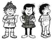
The artists who influenced my own work were strip
cartoonists, like Dennis Collins on THE PERISHERS, Posy
Simmonds on THE SILENT THREE in THE GUARDIAN, or
children’s book illustrators like Raymond Briggs and
Herge, of TINTIN.
|
|
 The
Perishers
|
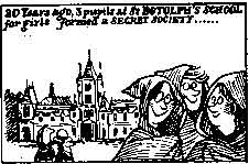
Silent Three
|
|
The lettering artists whose work influenced me were Sam
Rosen and Artie Simek on CONAN, Tom Orzechowski on
WARLOCK and UNCANNY X-MEN, Steve Craddock on CAPTAIN
BRITAIN, Tom Frame on JUDGE DREDD and Annie Parkhouse on
PRESSBUTTON and DOCTOR WHO.
|
|
|
|
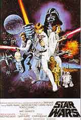
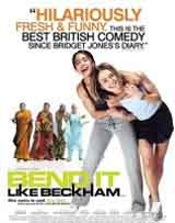
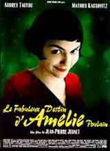
In
general, I am attracted either to Science Fiction
stories like JUDGE DREDD, ALIEN, STAR WARS or BLADE
RUNNER or down-to-earth, kitchen sink drama and comedy
like BEND IT LIKE BECKHAM, AMELIE, FAWLTY TOWERS,
NOTTING HILL or VICAR OF DIBLEY. In these two genres, I
think we learn the most about life... Comedy and Fantasy.
|
|
|
|
|
|
M-D: If you hadn’t worked in comics, what would you have done for a
living ?
R.S.:
I
would have worked in publishing at some level. I got into
comics after working at two small publishers in England as a
proofreader/ copy editor. I daresy I would have sought to
work at the BBC in England in some capacity, preferably in
TV drama. My mum would have like me to have been a doctor
but medicine never truly appealed to me.
|
|
M-D:
Could you describe your typical day ?
R.S.:
Only inasmuchas I have no typical day. For me, one day may
be paperwork, writing checks to pay bills or selling books
through Diamond, or ensuring that a new book we are
publishing goes to the printer, or maybe lettering CONAN
or BATMAN, or today I was working on my new column,
FATHER’S DAY for the website, COMICWORLDNEWS, which
relaunches next month. Last week I wrote the script for
the next issue of HIP FLASK which the artist Ladronn will
be starting to draw very soon.
There’s never a dull day, never a day with nothing to
do.
|
|
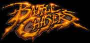
M-D: you designed many logos for comics, could you
tell us how does it work, do the editors have specific
requests or are you free to create ? do you make many
propositions for them to choose from ?
R.S.: I create very few logos myself — John JG Roshell,
who has worked with Comicraft more than 11 years, has
created most of the logos on our site. But, yes, we submit
ideas which editors or creators ask us to modify or refine.
I co-created the BATTLE CHASERS logo with Joe Madureira. He
had some specific ideas which we tossed back and forth. He
very much wanted a logo that looked like a logo for a
PlayStation game. Some time later the creators of JAK AND
DAXTER ripped off our BATTLE CHASERS logo for their
PlayStation game!
|
|
|
M-D:
About lettering,I think people generaly won't notice it when
it's nicely done and will only notice it when it's bad ( similar
to the work I do in movies ;) ), can you explain to us a little
bit of the lettering process
?
R.S.: Unfortunately, I think that although the
digitization of comic book lettering — for which I’m either
praised or blamed -- was inevitable and essential, lettering is
STILL regarded as little more than a necessary evil -- a
mechanical production task assigned these days to the lowest
bidder. Marvel's recent one-font-fits-all approach is the
clearest example of this mindset.
Having worked closely with top artists and writers like Brian
Bolland, Tim Sale, J Scott Campbell, Joe Madureira, Kurt Busiek,
Jeph Loeb and Jim Lee we learned the importance of creating
lettering styles that suited each of the
books presented to us. Artists always appreciate the extra level
of attention and seek us out when they're working on new
projects.
In America the search for guaranteed success creates an
homogenous world in which you can drive to a 7-11 on the East
Coast and fill your basket with exactly the same candy bars,
sodas and magazines you would find in a 7-11 on the West Coast.
Pull into a Motel 6 anywhere in any state, and you can turn on
the TV and watch M*A*S*H or I LOVE LUCY reruns at pretty much
any time of day. Travel the equivalent distance from LA to New
York in Europe and you'd be lucky to find a store that even
remotely resembles a 7-11, let alone the same sodas and
magazines you'd be able to find at home. Turn on the TV in Rome
or Madrid, and even once you got past the language barrier,
you'll be hard pressed to find your favorite show. I find
Europe's infinite variety very reassuring, and America's pop
tart accessability completely unnerving. German graphic design
is radically different to French graphic design. Dutch design is
easily distinguishable from Italian. The personality of each
culture is captured and communicated in each country's
typography and yet, nourished by the sensibilities of their
neighbors, continues to evolve.
When I moved to New York from London, I was surprised to note
how much one letterer's work resembled another's. I soon
discovered that I was the only letterer working in the states
with German technical pens. Most every letterer working out of
the Marvel and DC offices worked with American "Speedball"
nibs and so right there and then my work was regarded as "different."
It's ironic, therefore, that when I first approached US
publishers with the concept of "computer" lettering
that they were afraid to lose the personality provided by hand
letterers. Whether by accident or design, hand letterers in the
States had already created amongst themselves a somewhat
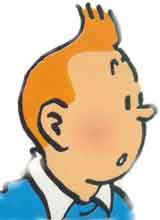
soulless uniform style. Having worked on 2000AD, I was
accustomed to a variety of very different styles. TINTIN, which
had always been a favorite of mine growing up, was lettered in a
gentle lower case style. ASTERIX was lettered by the artist,
Uderzo, in a fluid, warm and humorous upper case style.
I have never felt content lettering all the books I'm involved
in in one set way. Even today, some letterers and artists regard
the computer as the enemy of personality, but in reality, it is
the liberator. Thanks to the imagination of the programmers who
created Illustrator and Fontographer, we are able to provide
each book we letter with its own unique style. Most recently we
have created a series of fonts based on the handwriting of the
artists who create the books on which we work. Naturally enough,
only the rhythm of THEIR penwork, the pressure THEY place on
each stroke and each period, can truly complement the mood and
rhythm of their artwork.
When James Cameron spent over $200 million dollars on his movie
TITANIC, he did so in order to guarantee a level of authenticity
that he felt would make his story that much more convincing.
Although I'd be pretty ticked off if JG or any of the other guys
here turned in an expense report adding up to $200 million,
there have been occasions when we've lavished more time and
attention on a project than might appear to make financial sense.
I doubt whether very many people noticed that the cutlery on the
tables in the dining room set of TITANIC matched the ones that
sank on the real ship in 1911, but I'm sure the success of that
film had a lot to do with the fact that Cameron cared about that
kind of detail. I think the same is true of the lengths we go to
to ensure that the unique styles for STEAMPUNK suit Chris
Bachalo and the letters we create for Tim Sale on HULK GRAY or
the upcoming CATWOMAN series suit his work.
That said, I think that Comicraft's Greatest Accomplishment is
our library of commercially available typefaces at
www.comicbookfonts.com. If I had a penny for every
self-publishing artist or writer who has come up
to the Comicraft booth at conventions and thanked us for making
our fonts available... Well, I'd have a lot of pennies
|
|
M-D:
If you were a comic book character, who would you be ?
and why ?
R.S.:
I’d be HEDGE BACKWARDS, because he IS me, and I am
he. His misadventures are on the web at www.hedgebackwards.com I
must find time to create more!
|
|

|
M-D:
What’s your favourite movie ?
R.S.:
That
would have to be either ALIEN or BLADERUNNER. These are films I
can watch again and again and never get bored. The work of
Ridley Scott is always rewarding, I find. I also like movies
like MINDWALK, AMELIE, NOTTING HILL, the original PLANET OF THE
APES, LOCAL HERO, CHITTY CHITTY BANG BANG, JEAN DE FLORETTE/MANON
DE SOURCE, MONTY PYTHON’S MEANING OF LIFE & LIFE OF BRIAN.
|

|
|
M-D: What’s your favourite song ?
R.S..:
Ohhh, it’s hard to pick out just one, but I listen
to the soundtrack of BLADERUNNER all the time, especially
when working. I also like the work of Mark Knopfler, Peter
Gabriel, Elvis Costello, The Pet Shop Boys, Lloyd Cole and
Leonard Cohen. A favorite song might be “The Wind” or
“How Can I Tell You” by Cat Stevens or “The Way it
Always Starts” by Gerry Rafferty and Mark Knopfler (from
the movie LOCAL HERO).
|
|
M-D:
do you listen to music when you
work
?
R.S.:
Yes,
we listen to a lot of soundtracks like those mentioned above,
as well as THE STRAIGHT STORY, AMELIE, PULP FICTION and
bands like RADIOHEAD, QUEEN, U2, PINK, EMINEM, VANGELIS. We
also listen to Public Broadcast stations like KCET and some
books on tape — we just finished listening to WIDOW FOR
ONE YEAR by John Irving -- and radio shows from England like
JUST A MINUTE, DEADRINGERS, I’M SORRY I’LL READ THAT
AGAIN and THE HITCHHIKER’S GUIDE TO THTE GALAXY.
|
|
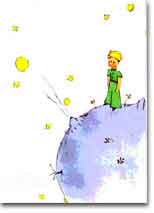
M-D: What’s your favourite book ?
R.S.:
These
are difficult questions! Here I’d have to pick either LETTERS
TO A YOUNG POET by Rainer Maria Rilke or THE LITTLE PRINCE by
Antoine de Saint Exupery. Books to read again and again.
|
|
|
M-D: Is there a comic book character that you really can’t stand ?
which one and why ?
R.S.
:
No,
but the American obsession with super heroes is hard for me
to totally understand.
|
M-D:
Did you have some hard times in your career ? which ones
and how did you deal with those ?
R.S.:
Working as a freelancer is always hard, but financially
some years are harder than others. It was very hard for me
to build a new living and career in America when I moved
to New York, then LA, in 1989. For more than a year, I was
barely getting by, but I was very determined and used my
Buddhist practice as a source of energy and focus.
This past year was also very difficult, as the big
publishers have sought to save money by using inhouse
resources for lettering and design. However, every such
cutback forces us to reevaluate our goals and capabilities
and 2003 was a great year for ACTIVE IMAGES as a publisher
of fonts and books, even as it was a tough year for
COMICRAFT as a design studio.
|
|
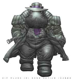
M-D: What is your best achievement so far ?
R.S.:
My
greatest personal achievement has been raising a family in
Los Angeles — it’s much harder than anything I confront
in comics! My greatest professional achievement has been
working with Ladronn on my character HIP FLASK, and
publishing the work myself.
|
|
|
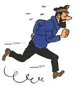
Captain Haddock
|
M-D:
How did you get the idea for Hip-Flask ?
R.S.: I’ve always liked wordplay — I loved the names of
characters like Various Flavius and Obelix in the Asterix books,
and I was constantly on the lookout for nouns or phrases that
sounded like they might make good names. As a kid, my Mum would
often remark that I looked like I'd been pulled through a Hedge
Backwards, so it only seemed like common sense that my comic
strip persona should go by the name "Hedge Backwards!"
I had high hopes that my strip would slowly gather momentum and
develop into an adventure series rather like my all-time
favorite comic series (of all-time), TINTIN. Unfortunately,
Hedge seemed content to merely wander around the strip just kind
of passing the time -- much like I wandered around Los Angeles
passing the time when I moved out here in 1989, not surprisingly
enough. I created Hip imagining that he would be the Captain
Haddock to Hedge's Tintin. Take a look at half of the TINTIN
books and you'll see that it's mostly his friends who get him in
trouble, the whole "investigative reporter" thing was
dropped by Tintin's creator, Herge, very early on. Unfortunately,
Hedge seemed content to merely wander around the strip just kind
of passing the time -- much like I wandered around Los Angeles
passing the time when I moved out here in 1989, not surprisingly
enough. A hip flask is, of course, a small metal bottle from
which hard boiled characters take slugs of whisky and so Hip
Flask seemed to me the perfect name for a PI in the Hedge
Backwards strip. He wasn’t a hippopotamus then.
|
|

|
My original intent was just to throw Hip into the Hedge strip
just to liven things up a bit and see what happened... but I
never actually got around to it. Long before then, I had
contributed "Vanity Case," a female PI character, to
my friend John Carnell for the spoof private eye series he co-created
with Andy Lanning, THE SLEEZE BROTHERS. SLEEZE was the only EPIC
comic published by MARVEL UK during my stint as Grand High
Poobah there. Of course, I didn't let them keep the name for
long. Vanity Case is now the name of Hip's fellow Information
Agent, the Scully to Hip's Mulder, as it were. "Hip Flask
and Vanity Case." A Vanity Case is like a purse, full of
make up and other feminine essentials. I wonder how well they
translate into French?
|
|
M-D: What type of script do you write ? Highly
detailed ones or very short ?
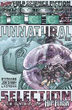
R.S.: The third issue of HIP FLASK, MYSTERY CITY, is the
first to be blessed with a full, detailed script. The first
issue, UNNATURAL SELECTION was based on a three page
“ashcan” I wrote for Ladronn after we had discussed
Hip’s origin. Over the course of several months, Ladronn
and I added extra sequences to the ashcan unbtil we found
ourselves with 31 pages — which was again expanded for the
hardcover edition. The second issue was built around a
twelve page script which Joe Casey and I put together three
years ago when we first started talking with Ladronn about
Hip. Ladronn had actually pencilled five or six pages of
ELEPHANTMEN before we started work on UNNATURAL SELECTION.
|
|
M-D: Do you plan on writing other comics in the future
?
R.S.: I’ve always imagined HIP FLASK as an ongoing series,
with covers by Ladronn, of course.
M-D: if you could write an issue of any other
published comics, which one would you choose and why ?
R.S.: I wouldn’t choose to write anyone else’s character, I
don’t see the point. All the BATMAN or DAREDEVIL stories
have been told, we know all we need to know about SUPERMAN
and SPIDER-MAN. I prefer to chart the fortunes of my own
characters, whose nature and stories are as much a mystery
to me as they are to readers. SPIDER-MAN was appealing
when he was a mystery. STAR TREK was appealing when it was
new and fresh.
|
|
M-D: I suppose you saw the really nice french
edition of Hip-Flask, were you involved in the format, paper
and so on ?
R.S.: I designed and lettered the French edition of HIP FLASK
UNNATURAL SELECTION as well as the Spanish and German
editions and our own English language edition. Ladronn and I
had gone to great pains to prepare the artwork of HIP FLASK
for the European format, which we both prefer, having grown
up accustomed to wider pages in comics (TINTIN, METAL
HURLANT, EAGLE, 2000AD etcetera)
|
|
M-D: Is there a question no one ever asked you in interview
and what would be the answer ?
R.S.
: No, I don’t thinks
so!
|
|
M-D: And since My
website is on Dr Doom mainly :
How
would you describe the character : DR DOOM ?
R.S.: He’s
a very strong character. Not necessarily evil but he is a
fascist who sees the world in a very particular way.
|
|
M-D:
Who do you think wrote Dr Doom the best ?
R.S.:
I loved the way John Byrne handled the character,
especially in INTERLUDE and THIS LAND IS MINE. Those were
my favorite FF stories. There’s a little bit of Doom in
the character of Nikken, creatoir of the Elephantmen in
HIP FLASK.
|

Nikken
|
|
M-D:
Who draw Dr DOOM the best in your opinion ?
R.S.:
I’d have to say LADRONN! He drew a shot of Doom and Apocalypse
for me which was never used. I’ll see if I can find a scan....
M-D:
arghhh I'm so jealous ! :)
|
|
Thanks a lot
Richard !
|
|
Go check Richard's compagny at
http://www.comicraft.com/
And
Hip-Flask official website: http://www.hipflask.com/
|
|
|